

Who Designs the Front Door? Power Structures in Digital Health UX
When we talk about digital health, most conversations focus on technology: the algorithms that predict disease risk, the apps that guide patients through treatment, or the wearables that track every heartbeat and step. Yet behind every screen tap and every login lies something far more decisive - the front door. The moment a patient or provider enters a digital health platform, they are met with an interface that either welcomes them, confuses them, or quietly nudges them in a certain direction. This “front door” is not neutral. It is designed, structured, and ultimately shaped by power.
Who gets to decide what the patient sees first? Which pathways are simplified and which are hidden in submenus? Is the priority efficiency for doctors, engagement for patients, or data collection for investors? These seemingly small UX decisions, where a button is placed, which symptom checker is highlighted, and which features require three extra clicks, are reflections of deeper hierarchies and interests in the healthcare system. The “front door” is where the competing agendas of clinicians, insurers, regulators, tech companies, and patients collide, and where their relative power becomes visible in design.
As digital health platforms become gatekeepers of access to care, the stakes grow higher. A poorly designed intake screen can deter someone from booking a telehealth appointment. A frictionless payment flow may privilege those who can pay out of pocket. A seamless provider dashboard may save time, but it may also quietly filter patient populations in ways that reinforce existing inequities. Understanding who designs the front door is, therefore, not just a question of UX best practices - it’s a question of governance, ethics, and justice in healthcare.
The Illusion of a Neutral Door
It’s tempting to imagine digital health platforms as neutral gateways, simple entry points to care that exist only to make life easier. Designers often speak the language of user-friendliness and efficiency, as if the front door were just an elegant technical solution to an age-old problem: how to get people into the system faster. But neutrality is an illusion. Every digital doorway is framed by choices - what is emphasized, what is simplified, what is hidden - that are rarely just about usability.
Consider the difference between a hospital portal that opens with a billing page versus one that foregrounds appointment scheduling. Both are “functional” choices, but each reflects a very different vision of what matters in healthcare. The first assumes patients are primarily financial actors; the second assumes they are care-seekers. Neither is wrong, but neither is neutral. UX here becomes a translation of priorities into practice, and those priorities are set by whoever holds the strongest voice in the room.
This is where power comes in. The “front door” is rarely designed by the patients who walk through it. Instead, it is shaped by administrators concerned about reimbursement, insurers focused on risk, investors pressing for engagement metrics, or regulators insisting on compliance. Patients and providers interact with the interface, but they do not write its rules. That imbalance of influence means the door does not open equally wide for everyone.
A critical question emerges: whose needs are privileged in the design process, and whose are sidelined? When the login process asks for an insurance ID before it asks for symptoms, it tells a story about priorities. When symptom checkers are tuned for common conditions but not rare diseases, it says something about where investment dollars flow. When language options are limited to English and Spanish, it signals who is welcome and who is expected to struggle. In short, the front door is a mirror of the system’s hierarchy, and UX is where those hierarchies quietly harden into practice.
Invisible Architects: Whose Hands Shape the Entryway?
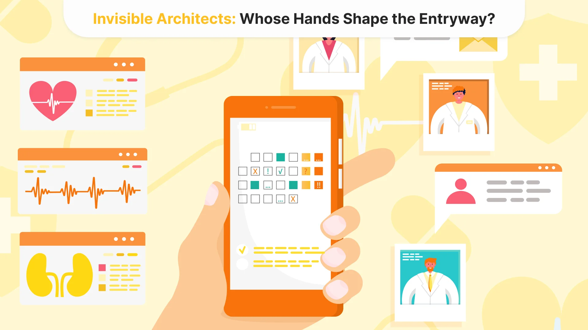
Behind every screen that claims to “simplify care” lies a negotiation table. The visible interface is only the polished surface; beneath it, different players exert pressure in ways most users never see. UX is not just a design discipline here; it is a battleground where economic incentives, bureaucratic logics, and clinical workflows collide.
Hospitals and health systems, for instance, often push for designs that ease administrative strain rather than patient navigation. The portal might streamline insurance verification or billing before it ever simplifies how a patient describes their symptoms. Insurers, in turn, use digital front doors as a subtle form of gatekeeping: eligibility checks, pre-authorization flows, and narrow provider networks woven directly into the interface. The result is that the design encodes limitations that feel “natural,” though they are in fact engineered constraints.
Investors add another layer. In venture-backed digital health platforms, engagement metrics frequently matter more than clinical outcomes. That priority is rarely stated outright, but it shapes decisions nonetheless: sticky notifications, gamified wellness prompts, and endless data collection forms masquerade as care but primarily serve retention and monetization. Patients are nudged, not toward better health necessarily, but toward behaviors that keep them inside the ecosystem.
Even regulators are not neutral actors. By demanding strict compliance flows - two-factor authentication, identity checks, audit trails - they often force interfaces into a posture of surveillance. While justified in the name of security, these requirements can also alienate users already wary of institutional control, especially marginalized groups with historically fraught relationships to healthcare systems.
And what about the clinicians? Ironically, their voices often get diluted in this mix. Doctors may want smoother ways to review patient histories or reduce repetitive clicks, yet their input is frequently secondary to the louder financial and administrative interests. In the end, the doctor might spend more time navigating the digital door than the patient does.
The key point is this: the “front door” is rarely designed as a commons, equally responsive to all. It is constructed through a hierarchy of voices, where those with institutional and financial leverage set the blueprint. The patient is expected to adapt to the door, not the other way around.
Consequences of a Power-Driven Design
When the front door reflects institutional priorities rather than patient realities, the result is not just frustration with clunky interfaces. It is a redistribution of access itself. The digital entryway becomes a sorting machine, channeling some users smoothly into care while leaving others stalled at the threshold.
Consider the U.S. rollout of vaccine scheduling portals in 2021. Many systems required users to refresh pages repeatedly, navigate complex drop-downs, and provide insurance details before even seeing available appointments. Predictably, those with high digital literacy and flexible work hours secured slots first, while older adults, low-income patients, and those without broadband were left behind. The design did not simply mirror social inequalities; it actively widened them by privileging speed and persistence over accessibility.
Another case comes from Epic’s widely used MyChart portal. Studies have shown that patients with limited English proficiency are far less likely to use secure messaging, not because they don’t want digital care, but because the language options and navigation are deeply constrained. The door exists, but it is linguistically locked for many. Similarly, disability advocates have pointed out that some portals still fail basic screen-reader compatibility, making what is supposed to be “universal access” a site of exclusion for visually impaired users.
Financial flows also shape the experience. Some telehealth platforms foreground credit card entry or insurance verification before allowing a patient to see a provider list. For someone who can pay, this looks like seamless efficiency. For someone uninsured, it feels like an invisible bouncer turning them away at the door. A frictionless UX for one group is a locked gate for another.
The normalization of these inequities is perhaps the most dangerous outcome. Patients who cannot navigate a portal often blame themselves: I must not understand technology; maybe this service isn’t for me. But this is not user error; it is a design outcome. The friction is strategically placed, even if indirectly, by power structures that decide whose care journey is worth smoothing and whose can be tolerated as rough.
Digital health, then, does not just digitize existing pathways; it encodes hierarchies into the very first click. What looks like UX failure is, from another perspective, UX success: the system has filtered its users, retaining those who fit the preferred profile and leaving the rest outside.
Conclusion: A Door That Decides Who Enters
The digital front door is never just an interface; it is a decision-making machine disguised as design. Every field required, every payment screen prioritized, every language omitted is a reflection of power, not accident. When portals filter users by digital literacy, income, or language, they are not failing; they are succeeding at reproducing the hierarchies that built them.
In this sense, UX in digital health is less about welcoming everyone and more about drawing boundaries - who is allowed smooth passage, who must struggle, and who never enters at all. Unless these hidden architectures are exposed and contested, the “front door” will remain less an entry to care and more a checkpoint where systemic inequities are quietly enforced.

Tell us about your project
Fill out the form or contact us

Tell us about your project
Thank you
Your submission is received and we will contact you soon
Follow us