
Figma for Streamline Designing of Interfaces
- Figma: Introduction
- Open design processes help to manage teams without distracting them
- Participation & collaboration drive productivity
- Sharing fosters result-driven, efficient communication with clients
- Tech features designers wanted since the beginning of time
- User discovery is available in advance
- Help designers work better to truly reach your customers
In 2019, it’s really hard to underestimate the importance of a product interface. Created carefully, in an approachable and consistent way and with a user in mind, it will provide a great experience and boost customer satisfaction. Designers create frontline for your digital product. They make your product loved.
To build a user-centred, meaningful interface, designers need to efficiently analyze gathered data, solve UX and UI challenges, communicate effectively with users and with a team, and be empathetic. Plus, of course, they need quick, functional, and easy-to-use tools.
Figma: Introduction
Cloud computing created a legendary shift in the tech industry.
For designers, a need to manage heavy files on the computer disappeared, replaced with opportunities to collaborate with co-workers in real-time mode, autosave files in the cloud, create interfaces faster, and, eventually, do more actual designing.
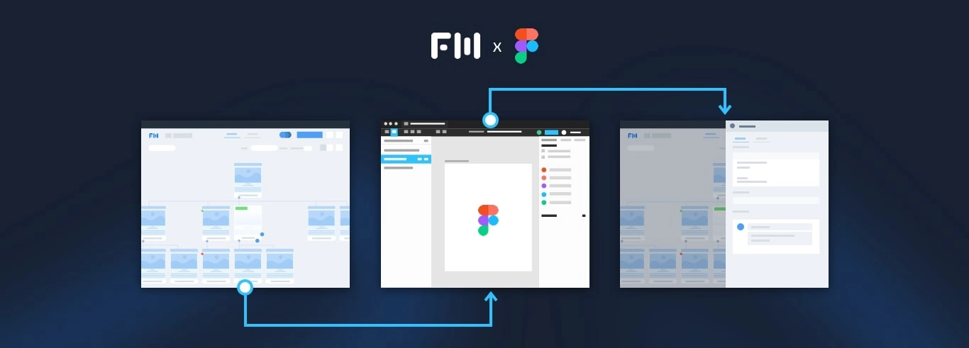
Figma, one of such cloud-based tools, was launched by Dylan Field and Evan Wallace in 2012. It was free (still is, partially) and it was presented as a web application and a desktop-based Electron program for offline work. The type of OS, for the first time, didn’t matter. Figma was like Google Docs for design teams.
According to 2017 Designer’s Toolkit survey, conducted by Taylor Palmer for UX Design, two years ago, there were three tools used by the majority of designers:
- Sketch for wireframing, interface design, and creating a design system,
- InVision for prototyping and handoff, and
- Google Drive for file management.
Figma, on other hand, was surrounded by doubts. a prominent response was provided by one of the survey participants, regarding new tools for designers: “None [of the new tools is needed for UI and UX]. Can we just stick to one that works? Designers are already tired as it stands.”
In retrospect, it seems like designers have disagreed. In 2018, Figma has beaten all Adobe tools (a cloud Adobe XD, used for screen-based design, Photoshop and Illustrator) and became the main competitor of Sketch. Answering the “Most exciting tool to try in 2019” question, the majority of respondents also choose Figma.
Why? Creators described Figma as a collaborative interface design tool. Their approach to engineering, implemented in their product and content that surrounds it is simple: deliver value, craft with love and empower your team. They do stick with these values.
In BeKey, we started using Figma after new senior UX and UI designer has joined the team. The transition from Sketch, Illustrator, and Photoshop was surprisingly smooth: As it occurred, Figma is much faster than them and very comfortable to use. (We really loved them though!) The fact that every project created with Figma can be shared with anybody in the team right away seemed amazing as well.
Soon, we noticed that Figma transformed the way we work in a team, with clients, and with clients’ products — for the best. Let’s talk about the features that made it possible.
Open design processes help to manage teams without distracting them
Businesses put a lot of efforts to trace and organize employees' productivity. They forbid them to work from home, oblige them to use time trackers or be active in Slack or Skype during the work hours, etc. Contrarily to these practices and in response to tendencies of the future of work, the demand for remote positions is increasing, as is the fondness of the distributed workforce principles among entrepreneurs.
Figma’s features of sharing, though, are comfortable tools for designers to organize and optimize their workflows by themselves. Sharing means co-workers can see their progress and managers can track their results without disrupting a creative flow. Also, no more “landingpageedit42” file names and no questions like “Is %filename% is ready?”. Fewer distractions, more actual work.
Participation & collaboration drive productivity
Companies that support and endorse collaborative work perform 5.5x better than those who don’t.
Figma is all about purpose-driven, efficient collaboration. Its commenting and multiplayer editing features provide designers and other members of a production team with an opportunity to analyze each other’s work directly in a document, share feedback, offer new ideas to try, and make better, insightful, and quicker decisions.
Besides, transparent design processes allow developers to dive into the building phase earlier. Thanks to Figma’s prototyping features and tools for creating product specifications, developers understand the structure, style, and logic of a project better and are able to engage faster. It’s not that a line between designers and developers blurred, it’s the software development became seamless and the roles of people involved emerged more connected.
Additionally, commenting feature is valuable for aligning project visualization with C-board’s expectations and vision: 88% of employees and executives believe that the lack of such alignment causes not-so-good consequences for a product. .
Sharing fosters result-driven, efficient communication with clients
Apart from in-team collaboration, the concept of an open kitchen in the screen-based design, embodied in Figma, addresses lacking transparency in the communication with clients. The platform provides tools to destroy the area of mystery that surrounds design processes.
Through live presentation function, we can guide clients through different aspects of a project that are in design right now. They can catch up with our progress any time they need through sharing too. Such transparency impacts communication greatly: they feel safe, in control, and less anxious. Meetings are also more constructive and resourceful.
We, on the other hand, are constantly gathering feedback and more motivated to react to clients’ comments in a timely manner. That decreases the number of alarms, surprises, and inconsistencies throughout the work process and, therefore, optimizes and accelerates product development.
Plus, we want our product to feel tangible and real for clients from the very beginning. With Figma, it can be done easily and with aesthetics.

Tech features designers wanted since the beginning of time
One of the greatest things about Figma is that its creators understand how designers think and what designers already want, see where and how designing can be simplified. Figma embarks on pains designers were dealing with for years, and proposes approachable, minimalistic, and exciting solutions for them. Seriously, we heard some people screaming. We listed some of these helpful technical features below.
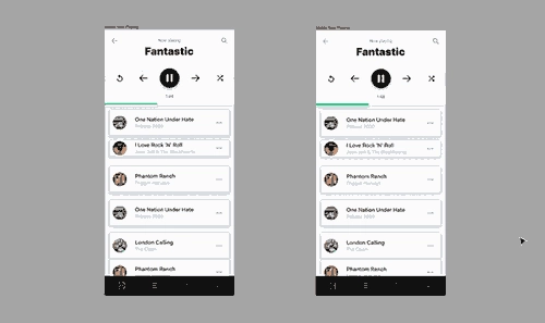
Component override. Consistency is one of the crucial parts of building an interface. Figma made this process — the implementation of consistency throughout the project — fantastically simple and quick with the feature that’s called (fantastic!) component override. It allows changing the properties of each child component (or instance) without breaking their connection with the parent (or master) and with other child ones. Designers can edit all components at once — change their color, opacity, add effects, filters, text, etc. — and edit each instance separately to adjust their design to their functionality and role in the interface. All changes are applied right from the layer palette. It’s also possible to reset any property aligned with a certain element.

Smart selection. “A computer is able to perfectly repeat the same action multiple times at blazing speeds, something utilized by writing professionals, software engineers, data researchers, and others. But not as much by designers,” said Rasmus Andersson from Figma in the company’s blog, introducing a smart selection feature that pretty much employed that reusability for UI and UX designers. Smart selection allows editing size, position, or spacing between three or more items at once. This feature saves dozens, hundreds of hours; especially the 2D version that works with lists and grids (the first version worked with lists only) — designers finally can easily manage components in galleries.

Constraints. In the mobile-driven world, it’s important to consider everything an adaptive or even mobile-first approach to building a product has to offer. Figma’s constraints feature drastically (!) simplifies the creation of cross-platform interfaces. It allows to set a behavior pattern for objects and define how they’ll change if the screen size changes. Also time-saving.
Figma offers more interesting, useful features, but we won’t go through all of them.
What we wanted is to demonstrate the crazy amount of resources that can be saved with the platform. Working with Figma, UX and UI professionals spend more time innovating, seeking the most efficient solutions for their challenges, and feeling comfortable, instead of manually changing alignment or color of each phone icon on the prototype.
Surely, it would be wrong to say that the technical embodiment of Figma is absolutely flawless. But Figma’s team, as one that is truly dedicated to their values, provides consistent support, promptly responds on bug reports, and, generally, really cares about their users. Which is nice.
User discovery is available in advance
According to UX Measure, by 2020, customer experience will overtake price and product as the key brand differentiator: how people interact with a product will be more important than what a product is. The conclusion is rather simple: designers need to create interfaces responding to how users will use them; each design decision should be driven by customer research.
Now, to test research findings, teams need to present a prototype of a product or an MVP to see if they’ve got customers expectation right. Figma can be used as a tool for testing a prototype. Moreover, through sharing, designers can watch user journey in the real-time mode and gather insights on how to make a product more accessible and straight-forward in its visual appearance and language.
Help designers work better to truly reach your customers
“Design puts ideas in front of users, gets feedback, refines the design and repeats this process until the client and UX designer both are satisfied,” said UX engineer Nadeeka Athukorala in UX Collective’s blog. We think, design can be perceived as a process based on the principles of iterative software development, where software is constantly changed and changes are constantly (at some stages, even automatically) integrated into all stages of product development. The iterative approach is used to, first, increase time-to-market, and, second, quickly react to customers’ feedback to actually stay on the market. (Digital transformation made us do that.)
Now, a design tool that is close to perfect in such a complicated, but exciting time, should help — let’s take utilitarian approach — designers work faster and more effective.
It doesn’t matter if we’re talking about contemplating a concept or creating the first version of an interface of your new app, about fixing a bug or finding an inconvenience in an interface after user’s report. A good tool for building interfaces has to be applicable both to designing an app, a site or a complicated program, and optimizing it. It should empower your team and provide it with opportunities to quickly build for long-term; to build around users; to be responsive and empathetic and provide a helpful tool, that will deliver value to your customer.
Tell us about your project
Fill out the form or contact us

Tell us about your project
Thank you
Your submission is received and we will contact you soon
Follow us
