

Mental Health Management Apps: Best UX Practices According to Science
- 0. Do no harm: general rules of building a mental health app
- 1. Include features based on cognitive behavioral therapy
- 2. Introduce personalized interactions and interventions
- Design with simplicity and for less effort
- Include environment for communication
- Language of the mental health app interface
- Final word: target, test, measure
There’s nothing worse than an article that begins with a phrase about “the fast-changing world of constant connectivity,” so, we’re going to start like this: it takes all the running you can do, to keep in the same place — yet, nowadays, it takes much more than just running to stay healthy.
Mental health issues, although discussed somewhat more in media, are still stigmatized. People with depression, anxiety, and other mental health illnesses become masters in pretending they are fine. Because if you’re not fine, you’re emotional and not productive, yet companies fail to approach that fact without bias, demonizing, and avoidance. Being not productive, on the other hand, is a quick road to hell in the, yes, “fast-changing world” that seems to belong to overachievers. Being depressed is still reacted to with “just do something already, stop whining.” Struggling with OCR is “just relax.” Being overloaded with stress and burnt out is “everyone’s doing it, and you can, either.” And that is so not helping.
What’s helping is raising awareness, affordable and accessible mental health care, and people who’re ready to listen and love you, unconditionally. Mental health apps are trying to cover all three, and, after such a long long prelude, we’re going to talk about how to build MHealth mobile app for it to really help someone.
0. Do no harm: general rules of building a mental health app
Mobile mental health applications have great potential in terms of:
- accessibility, affordability, and availability: and providing non-clinical people with tools and mechanisms to cope with their mental illness;
- remote mental healthcare: providing people who do therapy with a quick connection with their therapist;
- removing stigma and establishing healthy practices tracking ones’ own emotions and well-being and improving it.
Mental health apps give people not only more or less simple way to deal with their struggles. They also provide confidentiality, which means a great deal due to stigma and a fear of disclosure.
So, the good MHealth app would be, on the basic level and according to ADAA’s criteria:
- supported with a solid evidence base, both for treatment efficiency and for the app efficiency;
- personalized;
- interactive, with an opportunity for users to provide/receive feedback;
- easy-to-use.
We think it’s necessary to empathize on the first point: first rule of building a great mental health app (any healthcare app, in fact) is to collaborate with health providers or/and scientists. You’ll also need technicians with an experience in building apps in the healthcare industry — or those who’re ready to learn A Lot — to interpret clinical evidence for a certain treatment while designing user interactions. Recent research on Nature.com showed that among 1435 apps for Apple and Android, 33% were referring to non-existing treatment techniques and 86% were developed without real-life testing for ease of use, efficiency, etc.
No point in telling that’s a bad thing, so we say this: for an app to be used and valued and for a business to be profitable, being mean and dismissive towards science and user research is a bad strategy.
Let’s move to UX features that are advised to be included in mental health apps by scientists on ncbi.nlm.nih.gov , their examples and our thoughts on it.
1. Include features based on cognitive behavioral therapy
Cognitive behavioral therapy (CBT) is the most common and supported approach to dealing with a wide range of mental illnesses and conditions; its efficacy is proved by multiple studies. While used widely in therapy, it’s also effective as a measure of self-management of mental health and, generally, useful for everyone as a set of prevention mechanisms. In layman terms, the basic idea of CBT is for people to recognize that a) their feelings are a product of their thoughts; b) their feelings are not facts of the real world. For instance, if you’re thinking that “I’m a bad parent because I couldn’t come to my daughter’s school performance,” you generalize, catastrophize, and think in black and white. You’re feeling bad and you’re labeling yourself for it. Power of CBT is in the distinguishing and tracking such “automatic thoughts,” and re-arranging ones’ attitude towards self to more rational, acceptive, and mindful about what they’re thinking and what’s really going on outside and inside.
To inject CBT in a mobile app, you need to present users with three features or three sets of features:
Training sets for recognizing “automatic thoughts” (it could be explanations and exercises or machine learning algorithm that detects “biased” language in a note and provide users with possible mistakes in their thinking. If training is provided with through gamification and rewarded with, like points, milestones, etc., it’ll make users feel better for establishing new cognitive patterns and increase the probability of making cognitive exercises a habit.
Training sets for focus & attention. Mental illnesses are often followed with reduced focus, low productivity, as we’ve already said, and, generally, all the symptoms that make people feel useless. Scientists call this aspect of CBT “attention change”: you help users to grow the ability to focus on something not stressful and not demanding. This feature is often presented in a game format or in a form of mindfulness meditation.
Awareness & self-observational tools. Combined with the first point, these tools — notes for journaling, “thought checkers” that ask users to put what’s bothering them in a single sentence, and different mood/happiness trackers — help users see and understand changes in their behavior, reactions, and thought patterns.
2. Introduce personalized interactions and interventions
Personalization is one of the main demands for mental health applications. To achieve a high level of personalization, app developers have to add:
- multiple options for user customization. For instance, when offering mindfulness exercises, it would be better if users were able to choose their level of proficiency in meditation.
- data collection and processing algorithms. Mobile apps present a wonderful opportunity to use users’ personal data for a) constructing more authentic user interactions (which promote mental wellness greatly, as an expression of authenticity), b) using user-generated data in treatment.
The second point is where product team should be very carefully: privacy concern bothers a lot of people and, while a lot of them would agree to share their personal data and use them as a foundation to improve their health, you still need to inform, explicitly, what data are you going to collect and why do you need them.
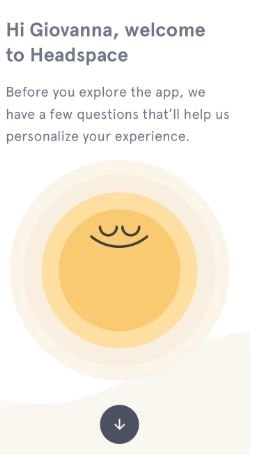
Personalization and real-time responses to user input — no matter how it is collected, via notes and language processing engine, wearables, or user’s voice — is called a formulation-based tailoring. The main idea of features that supports it is to engage users in the regular therapeutic (or, simply, useful) activities using real-time data and personal information users share with an app. Using data, the following features can be implemented:
Guidance through real-time activities and exercises. F.i., if users want to master meditation and have never done it before, you can offer interactive expanations that cover the following: what muscles are activated while inhale and exhale and how not to let external thoughts penetrate the “bubble” of meditation. What’s curious and sad, a lot of activity-based features in mental health apps do not offer such guidance. As researchers say, “many apps aim to provide a service but do not service a need.” Make sure your features do service a need.
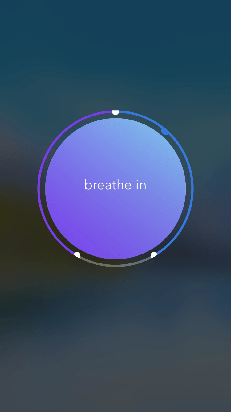
Push-notifications for check-ups and regular activities. Establishing and restoring ones’ mental health is possible only through consistent effort. “App-based intervention” is what may help users formulate a habit of caring about themselves. Such interventions are very useful to utilize as reminders, motivational cheer-ups to move towards a goal, etc.You can also use “opt-out” approach to such intervention: to assume users want to receive pushes within calculated intervals and with “default” triggers for a certain condition — and leave them an option to set up or turn off intervals and customize triggers. Such, so to speak, “persistence” is explained by specific of low mood in times of depression or anxiety blocks. Low moods mean low activity, in lots of mental health struggles, means reduced ability to feel good. Notifications and reminders enhance a mechanism psychologists call behavioral activation: they help to break the wheel of “I feel back” — “I do nothing” — “I feel worse”.
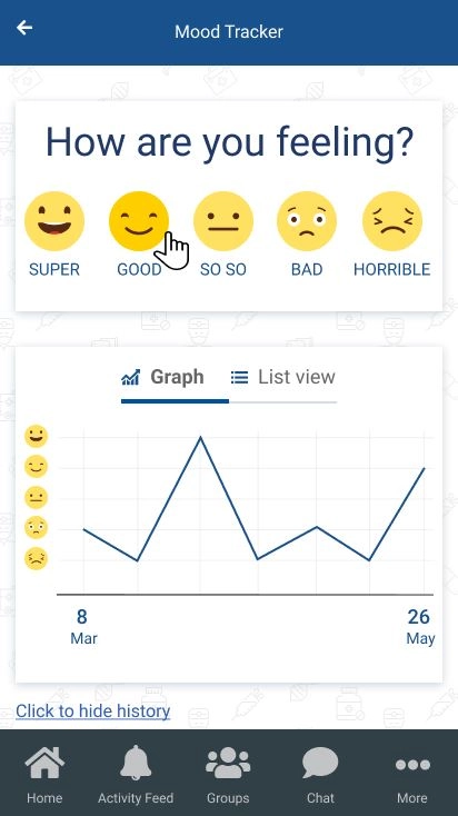
Mood and happiness trackers with data visualization. This point is pretty self-explanatory. There are tons of different trackers in mental health apps. In some of them, users have to rate how they feel on a scale from 1 to 10; others use “catastrophe scale” — users describe how bad things are. Trackers may include different characteristics of users’ behavior during the day, such as thoughts and attitudes towards people who are around, physical activities, eating, cognitive load and productivity, thoughts about self-harm, etc. Note, that it’s better to ask users to rate their mood — whatever scale or rating you’ve chosen — multiple times a day because people’s feelings are often biased when they’re describing it at the end of the day; hence, low-quality tracking.
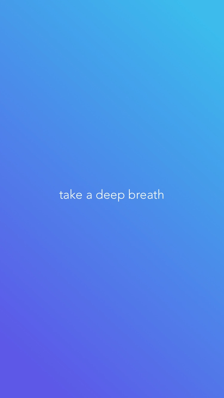
Features for immediate activities. Along with regular check-ups and reminders to, for instance, score their mood, it’s better to include features that users will use when something’s happening. That could be breathing exercises, games to regain focus or to re-focus, calm down, etc. These features are very important for people who are struggling with addictions, anxiety, panic, thoughts about self-harm, obsessive-compulsive disorder. The main idea is to give users mechanisms to keep themselves where they are and teach them to use these tools as parts of coping strategies.
Learning-centric scripts for games. One of the main parts of CBT is homework: you work on the sessions, and then you’re doing exercises at home. It’s easy to introduce exercises for negative thoughts recognition, acceptance, bias tracking, etc. in a mobile app. A wonderful thing about learning on a mobile app is that you can combine different channels for users to better understand some training cases (photos, audio, video). Simple, aesthetically pleasant game design with rewarding badges or scores for learning activities will invoke in users a whole scope of problem-solving skills. More they solve complicated cases, more masterful and confident they’ll feel about their emotional context. Which is rewarding and healing.
Design with simplicity and for less effort
Actually, designing interfaces for less effort is something that works for any app. In MHealth apps, though, simplicity is one of the characteristics that enforce the efficiency of behavioral activation we’ve talked before. Simplicity increases engagement and users’ sense of apps’ quality and credibility, therefore, it has a direct impact on a positive therapeutic effect.
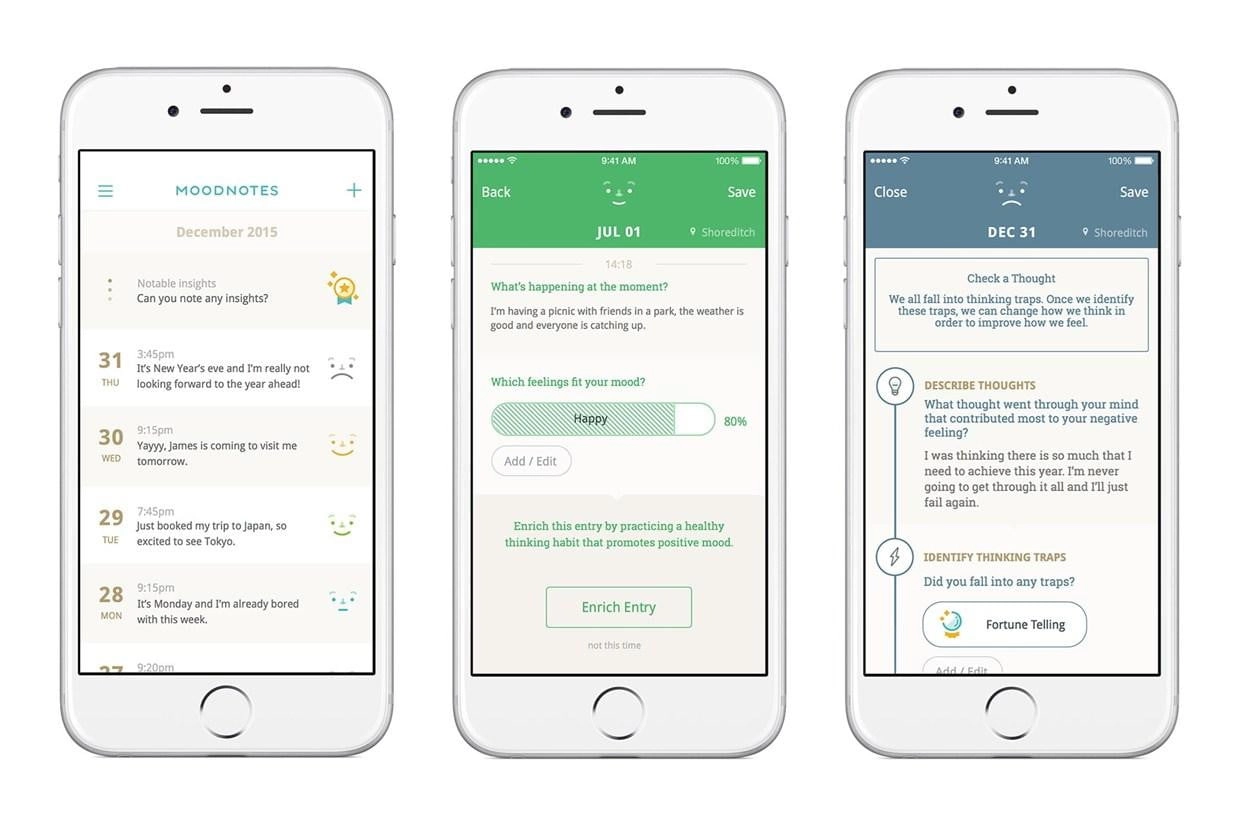
What “less effort” means for people with mental health issues? It means that the probability of them interrupting the process is reduced when they have to take no action or small, understandable action. In other words, if they need to spend minimum resources to do something, they’ll more likely do it. App demands for additional, not related to therapeutic tasks burden users who’re already low on resources, so make sure you keep interface simple, robust, and understandable. By the way, “opt-outs” we’ve talked about before is a thing that enforces “less effort design,” as is, for instance, automated integration with a calendar that imports date and time to the users’ journal.
Another aspect of simplicity is a reduction of cognitive load where it’s not needed by the app’s purposes. For instance, if you collect historical data and want to show users how their state of mind improves over time, make sure you’re displaying data insights in clear, interactive and actionable or rewarding way (!)
Include environment for communication
Communication is important for everyone, and people with mental illness are often struggling with it. Sometimes, they think that their thoughts are irrelevant and aren’t worthy of listeners. Sometimes, they are so overwhelmed with emotions that they can’t talk about it. In sum, there are a lot of reasons not to talk, due to MHealth stigma and shame or ones’ mood. So, introducing at least one of these features will be a good option.
- chats with trained (or, at least, tested) listeners;
- chats or video chats with therapists;
- forums or group chats, actively and rigorously moderated;
- or chatbots that are oriented on support and navigating through difficult times (like, for instance, Replica).
Remember not to force communication on users and include emergency phone numbers for people with suicidal thoughts.
Language of the mental health app interface
Perhaps, referring to people with mental illnesses as to sensitive people would be a trivial thing, but they are extremely sensitive — and the words you’ve decided to use to speak to them matter a great deal.
Keep the language inclusive. There are a lot of guidelines on the web on inclusivity in language — and much more jokes about “0 second since the last time I offended someone.” Gender-neutral language (the use of “they” instead of “he or she”), putting people first (“people with depression” instead of “depressed people”), refusing from using phrases like “mental disability” other rules for diverse language help people to feel more safe and comfortable. Among other things: if you aren’t sure how to address user, ask.
Use simple language. We think, mental health apps somewhat suffer from the disease that is common for all healthcare software: there’s an awareness gap between what physicians and scientists want to say and what their audience can and wants to digest. As it’s hard to write good science fiction, it’s equally challenging to write a good copy for mHealth. Don’t overwhelm users with professional terms. Keep sentences short and clear. Speak with users as you’d speak with your friends, with actual people. Note, that when we say copy, we mean not only blocks with content, which explain the nature of different cognitive distortions, we mean microcopy as well: words on buttons, instructions, etc. This text so far has a readability score of 12, which is a good result for our audience — but a bad result for a mental health app. You can check the readability of your copy on Hemingwayapp, the perfect score is 9.
Leave users a way to know more. While keeping it simple, it’s a good practice to let users increase their awareness on the subject, described in your app-based content. You can choose to link them towards relevant article or statistics on their query — or you can include more advanced educational options in the app, themselves. It would be good if all complicated scientific things would be followed with real-life proofs and examples about the topic, tell comprehensive stories and offer to participate in them. That will help users to relate more, know they are not alone, and reduce self-stigmatization.
Final word: target, test, measure
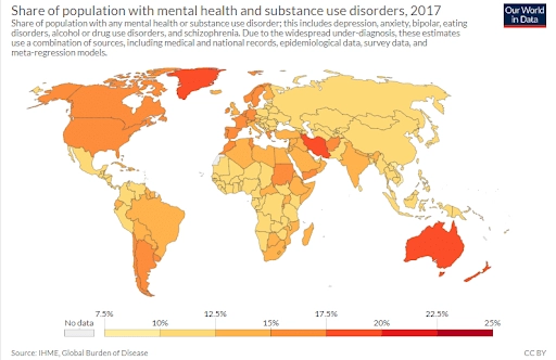
There is a demand for mental health apps: consumer all over the world want to improve their wellbeing. Often, they find themselves in a situation where real-life therapy is too expensive or non-existent in their location. There is also a talent recession in a field of mental health specialists. So, if you’ll decide to build such an app and do it, including, at least, advice from the paragraph on CBT, it will be useful.
We think tech people who work with healthcare specialists are capable of making great things together.
In addition, we wanted to recommend using cross-platform development options for your app — so users could access it and get help from any device (yes, including web-based application). Also, it would be easier for you and more clear for users if you are targeting groups with a specific mental illness (like veterans with PTSD, for instance), test and measure its efficacy and then scale it to other groups. Don’t forget about clinical trials, user research, compliance, and visible (!) privacy policy.
Subscribe to our newsletter to receive more tips on building high-quality healthcare applications and know more about digital health market.
Tell us about your project
Fill out the form or contact us

Tell us about your project
Thank you
Your submission is received and we will contact you soon
Follow us

