
Predicting Web-Design Trends for 2021
- Visible navigation mobile-style
- Eclectic visual story
- Interactive storytelling in web-design
- Blank space, made alive by a copy
- Hero text that and the picture - or video, or 3D animation near
- Retro-websites - in particular, 90s internet
- Grid and unconventional grid
- Neumorphism: between skeuomorphism and material design
- Color trends in 2021 web and curly stripes in the design
- About that recession
October is a month of ghosts and bad omens coming true, and we decided to do what every B2B blog is supposed to do, sooner or later: to write an article about web-design trends with predictions for 2021.
We figured what are the new trends in web-design by analyzing websites we’re using often, websites designers use to post their works, design awards that were held despite the pandemic, Pinterest, dribble, latest cases in the portfolios of creative agencies, and reports about changes that delightful 2021 is supposed to bring to customers.
Now, before we get to recounting what has been popular in 2020’s web-design and what will reach into the next year, becoming more refined and beautiful, a disclaimer: articles like this one are relative and subjective; there are no bad trends, there are trends that are used badly - it’s like with literature tropes. This article is not the ultimate truth. If you find our future web-design trends are not trendy enough (or too trendy for your taste) or notice something big we've missed, - write a few words to us, and we'll reflect on your feedback and, possibly, update our article. Let's begin!
Visible navigation mobile-style
Mobile-first web-design is what everyone's doing in 2020 - it’s a trend, yes, but it walks towards becoming an imperative. For mobile interfaces, it’s important to get users to a goal as soon as possible, which is why more and more designers (or more likely, product leads) decide to make a navigation bar as visible as possible - and do it in a way that doesn’t activate page reload. Take a look at this year’s Facebook redesign...

Or Twitter redesign

The special trait of mobile-first design for social media is putting the field for user-generated content in the center of the screen. Apart from that, other websites adopt mobile navigation in the same way — here’s the recent redesign of Mailchimp's menu.
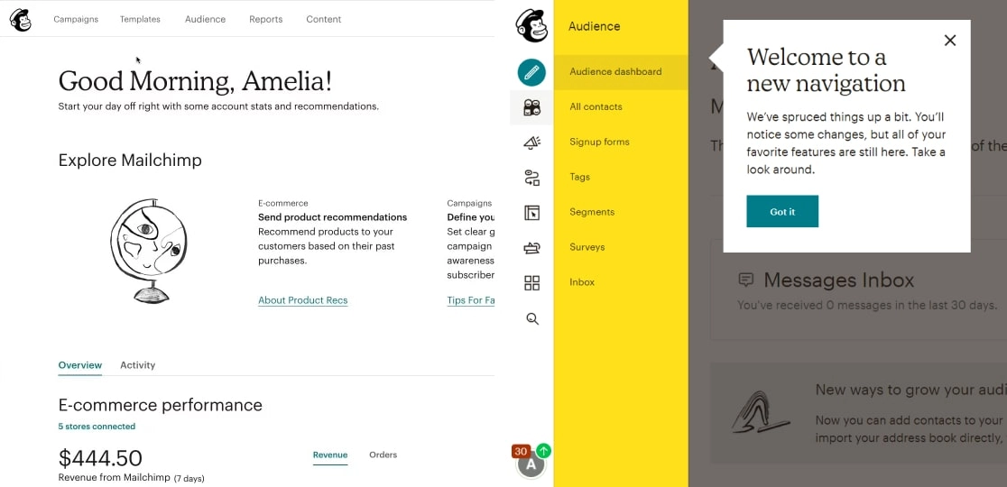
The visibility of navigation elements makes access simple and saves people time. At the same time, where lots of links are in play, navigation looks like a complex menu in a video game, so balancing considerations are in order. If you want to use this approach, be as clear as possible: with all our admiration for Mailchimp, their new design must have for people who've just come on the site and have never used its functionality.
Google Workplace has also been redesigned (and renamed) to simplify and unify navigation across different zones for collaborations in teams.
Eclectic visual story
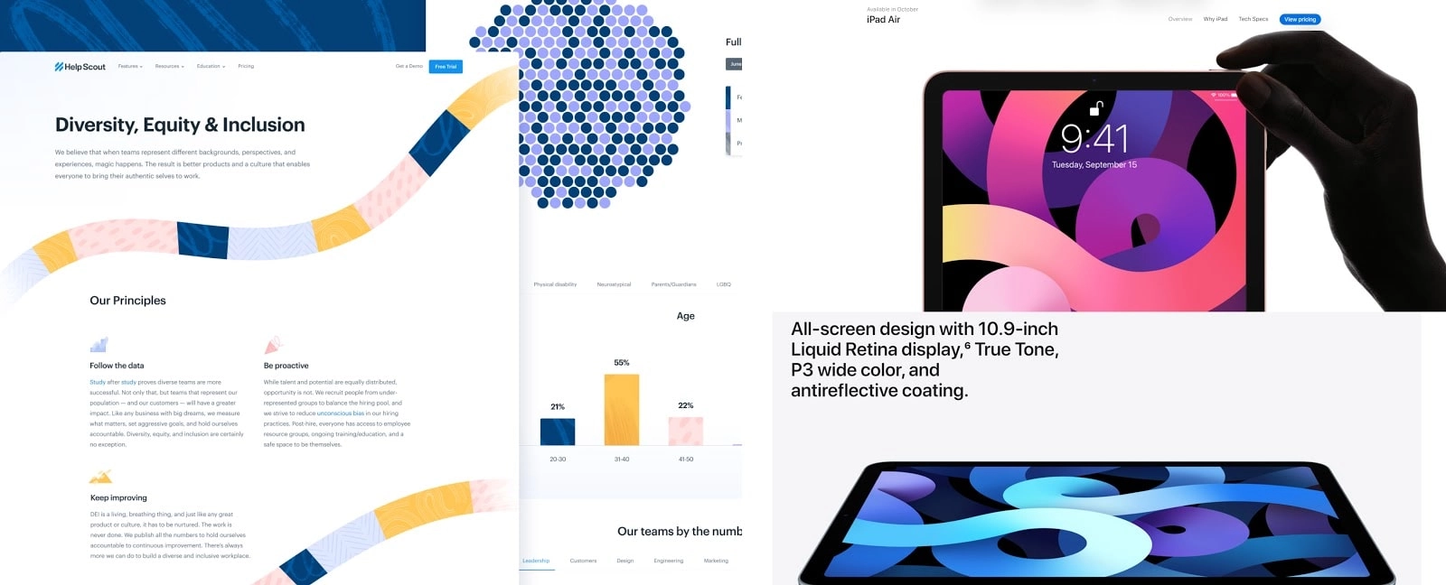
One of the current web-design trends is an eclectic style. People combine hand-drawn illustration and 3D, collages, street-art, and flat pictures and objects floating over each other. In advertising, we think a good illustration of this is the California Avocado campaign from the US MulinLowe. The page of Apple iPad Air is a perfect fit to discuss the eclectic in styles web-designers apply.
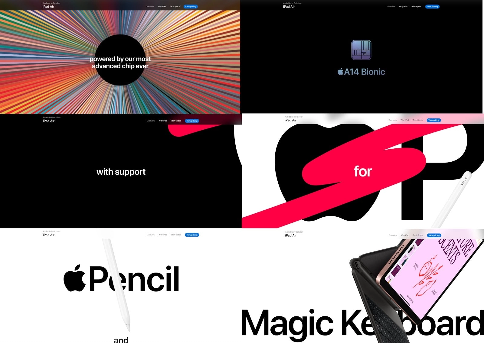
Apple designers combine large, clear text, real-life high-res photographs of the product, lots of negative space to contrast other elements - and all of this appears while the user is scrolling.
Now, this trend is not about taking every style of visual expression possible and putting it on the webpage. It’s the balance that makes it perfect: add brushes to photography, or markers to line art, or magazine-style photo crops followed by a strict text. Add a bit of color to the large humans on your landing page. Unflat them. Flat them back again. Highlight your CTA. But not all of this together.
Interactive storytelling in web-design
A good thing is that lots of brands (and not only B2C brands, right?) started using the advantages of the medium to tell people things. One of the recent trends got more popular is the animation: although in web-design, the animation is still a pretty controversial thing from the point of accessibility, it certainly helps create beautiful stories - and will continue to do so in 2021.

One StudioGusto design studio from Italy created a project with stories about their favorite movies that helped them get through the hardship of lockdown. On a more serious note, their campaign for Arena, promoting goggles shows how user-triggered navigation and 3D-modelling of a real object get users an experience of interacting with a product like in the shop (and we know if people take something from the shelve - the analog of this action is happening virtually here), it’s harder for them to put it back.
One of the most common uses of scroll-based navigation is to tell about the history of something. Check out the website of the Met Museum about its 150-years life.
On the contrary to what people say about B2B brands, they, too, can and do use animation to convey the story about their services - and quite successfully. For instance, this project by Studio Vor for a Canadian medical company or design of VC Swipe. Seriously, just look at them.
The joy of user-triggered animation is that it can advance the narrative (what you’re trying to say on your website), it can help you bring users to a point - to any CTA you’ve put up - if you have a commercial web-site, and it also can serve purely aesthetic purposes and help users just stare in the screen for hours.
We think the web-design comes a bit closer to narrative design in games, where objects on the screens and locations are NPCs, and every user’s action triggers an opening to a path. Of course, most of the websites hardly provide multi-choice gameplay, but the fact at least this aspect of web design gets variety is good - in the world of mostly homogeneous pages. By the way, Officia Studio has created an old-games inspired brand identity for Muovo 2020 - and, it seems that cool motion designers agree with us on the point of web-designs getting more interactive and user-dependent.
Blank space, made alive by a copy
The thing about blank space, as it’s about other aspects of minimalisms, like a modest color palette, several lines of words, not a lot of pictures, clarity, and functionality - is that all of it doesn’t work without a good copy.

This web-site that fights against climate change also uses blank space: some would say it cannot be called minimalists, but minimalisms aren’t about fewer things, it’s about just enough things - and we do think every element on these belong here.

Even the bubble animation. And hey, minimalism doesn’t require blandness of the tone. You can be witty and excited and show-off via minimalism, and that’s kind of the point.
All the blank space leaves you an opportunity to elevate your tone using fewer elements - even words, only. We heard the new web-design trend is using this opportunity. Like here:
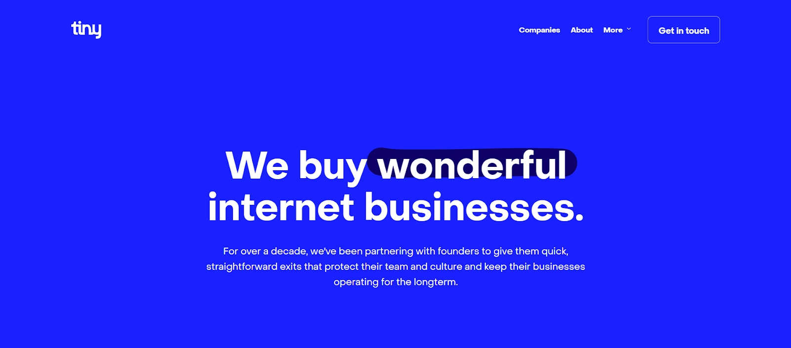
Hero text that and the picture - or video, or 3D animation near
Usually, the text is a value proposition and/or call to action, like here on Maze’s website.
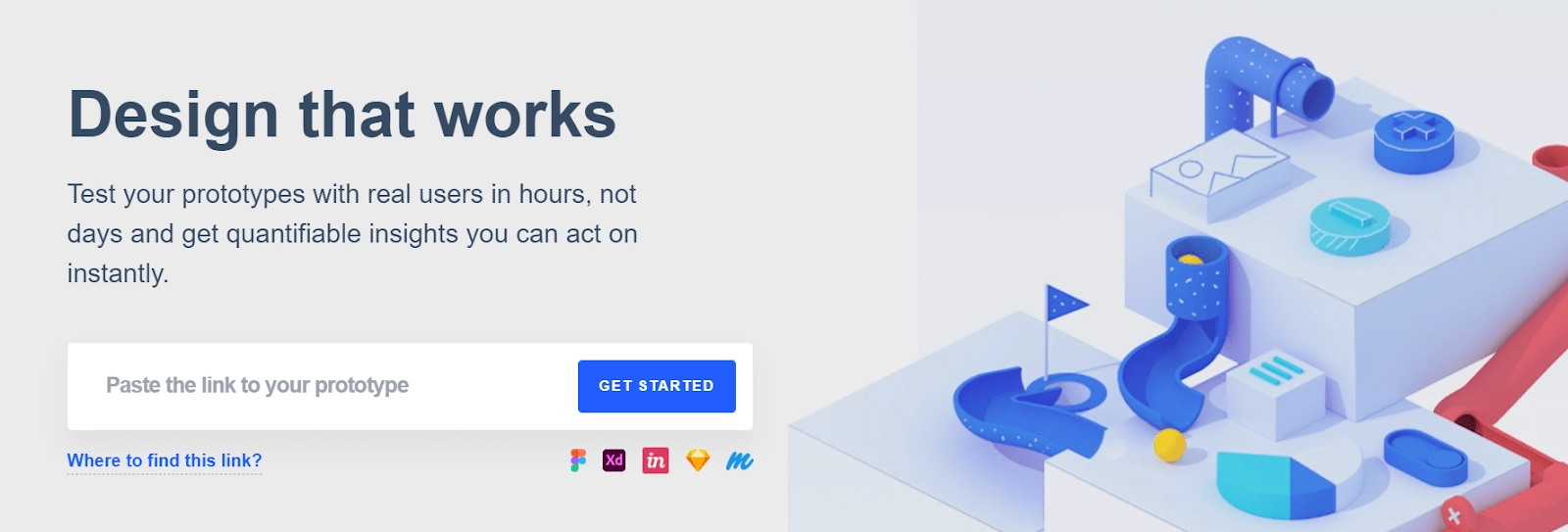
This one won’t go anywhere from trends in web-design and will persist, in our opinion, until someone will come up with something better than telling users what you have for them.
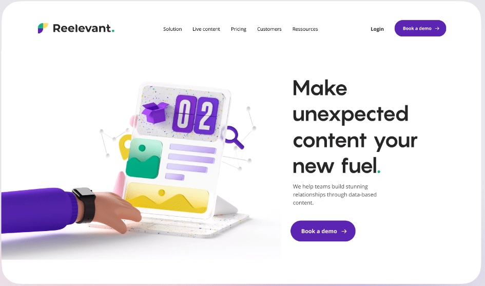
Some advice on this front? Well, make sure that whatever thing you’ve chosen for the first impression of your page doesn't send users’ devices into lagging.
Retro-websites - in particular, 90s internet
Trends walk in circles (or in spirals?) Along with mimicking real-world objects, the aesthetic of the 90s internet started to win their way back to our screens.
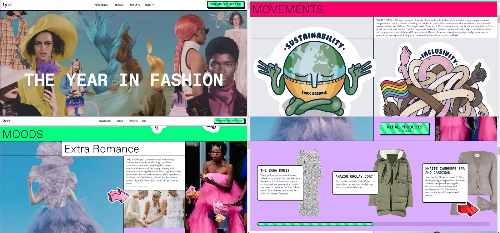
The “old internet style” is used for portfolio pages and e-commerce websites (partially, right) and even - a shocker - by IBM.

What comprises this aesthetics? Mouse-following pictures, large clickable elements, bright, acid colors, contrasts, sharp geometry. A bit of cyberpunk-inspired fonts. Illustrations that combine, again, photo and drawings. A bright, clean copy.
Designers draw inspiration not only from past years of the internet. They get it from fashion and cinema and other visual trends that were popular back then: take a look at inspired by 80’s Vogue’s microsite, with scroll-based storytelling, video, animation, pixel microcopy elements, and other curious things we didn’t think we’ll see again.
Another example of the informed-by-the-past-trends trend is the brand identity for musical service Mixcloud, created by Studio Output.

To get a better feeling of what it’s like to use old internet visuals for products, take a look at this Air Max presentation (looks better in presentation mode.) It worths it.
Apart from them, brutalism that has been coming back to the web for the last few years seems to be staying to gain more popularity in 2021.
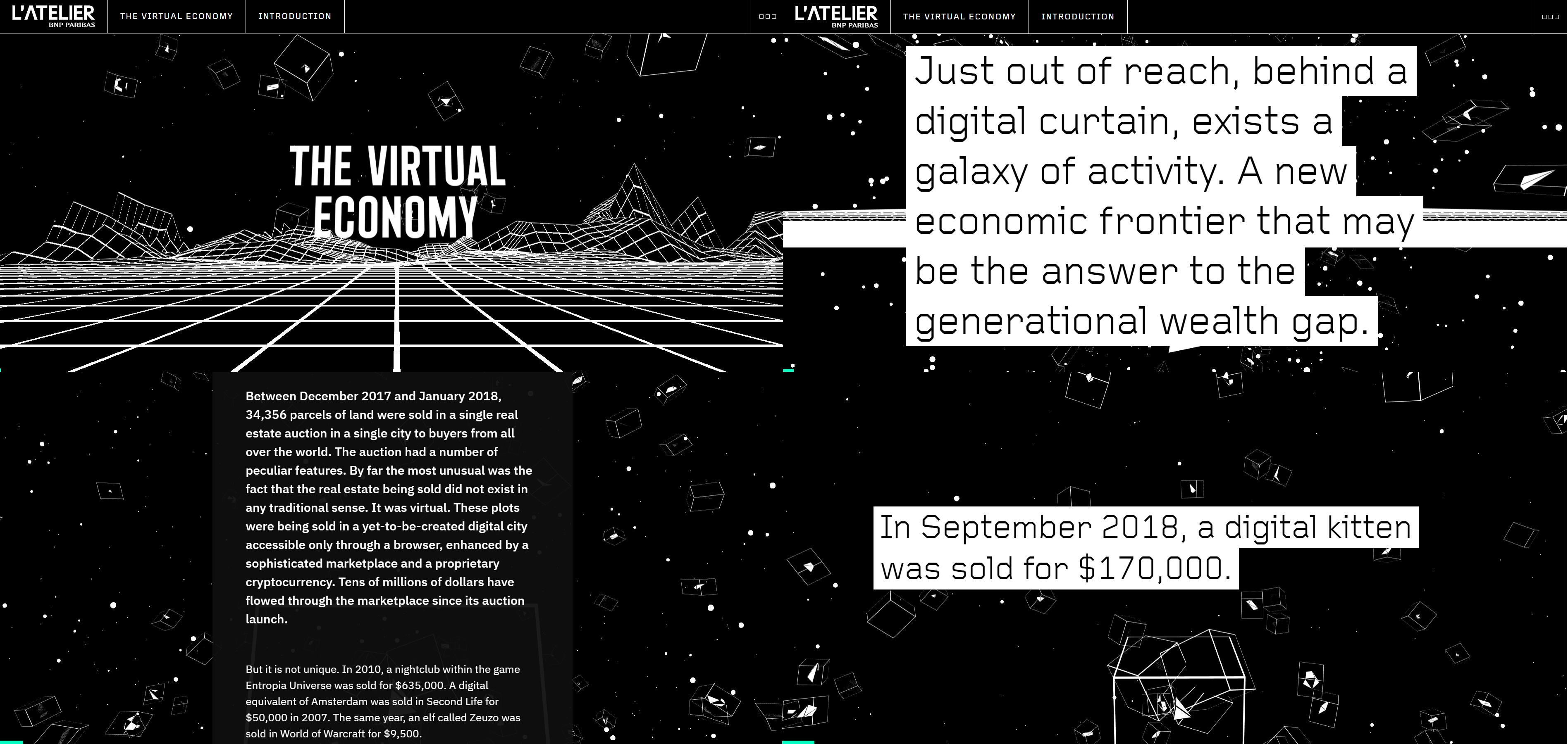
Brutalism is an architectural term that describes a style that makes buildings look heavy, ruthless, almost out-of-the context of the surrounding urbanistic layout. In web design, it's a bold, unapologetic, often overwhelming form, large blocks of content, color, or graphic elements. On the peak of expression, brutalism turns to antidesign, where classic hierarchy between different elements of the site is disregarded, mocked practically, where navigation is unclear and often absent. Antidesign is a radical response to the uniformity of modern websites.
Brutalism is an architectural term that describes a style that makes buildings look heavy, ruthless, almost out-of-the context of the surrounding urbanistic layout. In web design, it's a bold, unapologetic, often overwhelming form, large blocks of content, color, or graphic elements. On the peak of expression, brutalism turns to antidesign, where classic hierarchy between different elements of the site is disregarded, mocked practically, where navigation is unclear and often absent. Antidesign is a radical response to the uniformity of modern web-sites.
Grid and unconventional grid
Time to talk about the grid. Most sites on the internet have been created with WordPress or other website bootstrappers, and their layout is underlined with a grid. Today, lots of companies and their web-designers started making the grid visible, changing it, adding blank space and animation, creating an asymmetry between objects within the grid, and so on.

We think the popularity of grid in navigation is partially due to the card metaphor that has been popularised by mobile and social media. We’re seeing cards constantly these days: on Instagram, on Pinterest; a Facebook post is a card, as well as a snapshot of your taxi mobile application when you’re driving home.
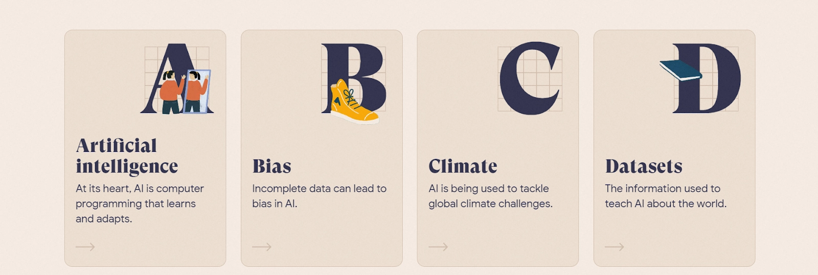
Cards summarize everything users need to know in neat, brief copy.
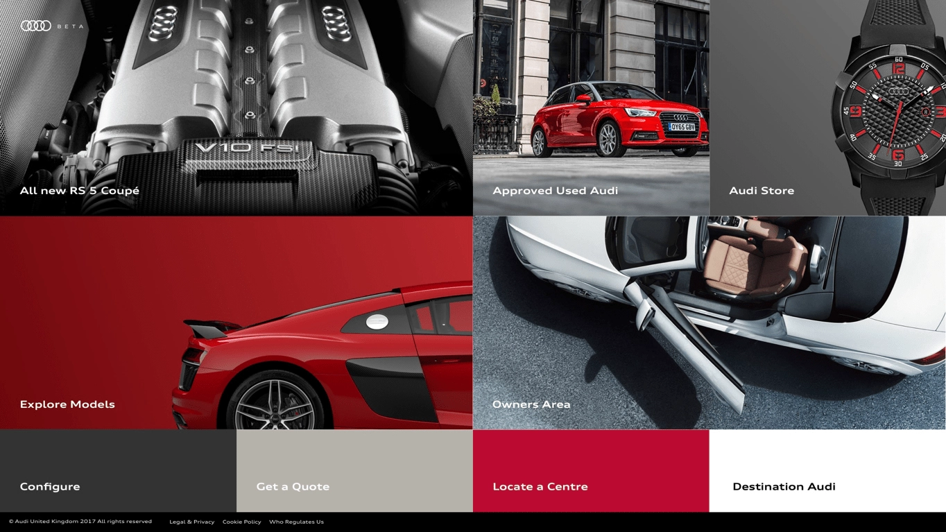
That reminds us of Windows 10 interface a bit, and that is not accidental. Platform-agnostic design sometimes means we’re using the interface for touch for users with laptops as well.
2021 kills clutter in e-commerce web-design
New consumers - both in the real world and on the web, as e-commerce sites are in 2020 just retail sites, will want more simplicity and directness in the way they shop.
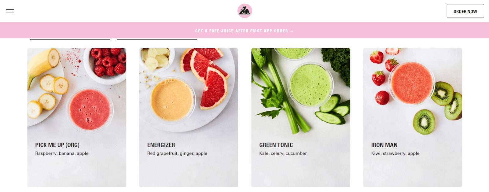
The overwhelming, bright assortment Amazon-style might be a turn-off for niche retail businesses, so we highly recommend e-commerce to reduce the amount of thinking a website requires from users.
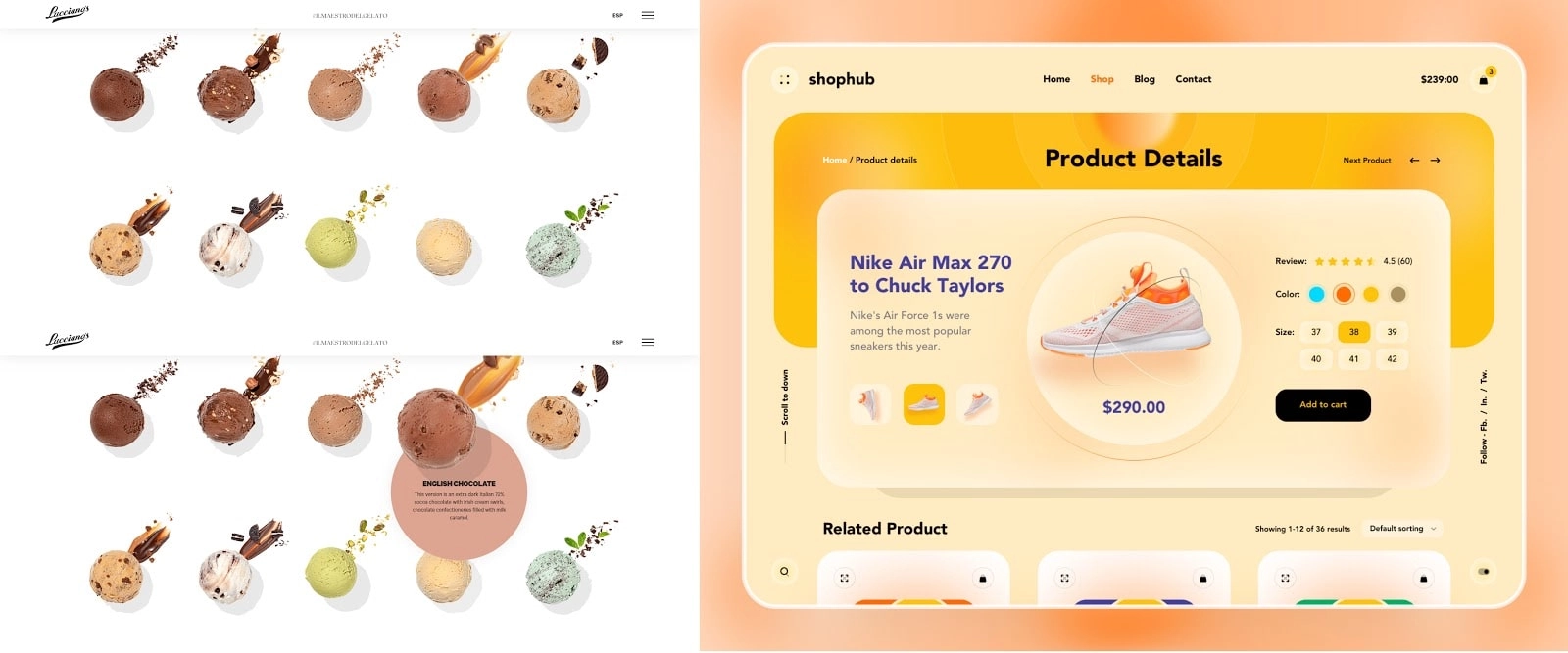
So, e-commerce will shift to a design that just takes users from point A to point B without delighting them: understandable product labeling with clear microcopy is a must here. On another point, that doesn’t mean that the visual feeling itself has to be dull.
Neumorphism: between skeuomorphism and material design
So, remember these buttons? They look ridiculous, but in the early internet, their plus has been in the fact they repeated real-life buttons on users’ controllers or phones or whatever. Then, everyone got used to it, flat, and then material design came into play, and we started seeing flat buttons and the absence of shadows and gradients, as the interface has to be practical.
One of the latest web design trends is getting away from material design again — and getting just a tiny bit closer to skeuomorphism (replicating the real-word object.) The word for this is neomorphism, and Michael Malewicz used that word for the first time last year.

It looks pretty - or pretty retrospective, depending on one’s preferences, but if you’ll choose to use it, be very careful with the contrast and the pressure on the perception it puts. Developers did a tool for you to test buttons in neumorphism with your brand colors.
Color trends in 2021 web and curly stripes in the design
Hey, you know that the Pantone color of the year is Classic Blue, and we did see some of them. According to the cool sites called colors, the trending color palettes right now are these

So: pastels. We’ve also seen quite a lot of cyberpunk colors, and we suppose that with the release of Cyberpunk 2077 - and with more dystopian moods spreading across the countries - there will be more of them.)

Also, this year we’ve seen quite a lot of texture - another way to convey the real feeling of the object in addition to shadows that create weight.
In 2021, we think classic geometric forms that were very popular in the past years - triangles and squares and lines will be slowly replaced by stripes and abstract gradients on them in triple complementing colors or bright contrasts.
Web-design trendy things to meditate on before 2021 kicked in
If you sometimes visit dribble - or just travel through lots of commercial websites, you’d probably noticed that a lot of websites look pretty much the same. We won’t be dwelling on whether it’s a good thing or a bad thing: websites now have to be platform-agnostic and it’s easier for developers and designers to work via the homogenous form. Moreover, it occurs new interfaces are scary and often unclear; patterns are soothing and allow users to save time thinking how to navigate your thing.
But it’s hard to argue the fact similar designs are, sooner or later, become boring. We think that’s one of the reasons bright (both warm and almost acidic) colors, 3D, and animations of different sorts are becoming so popular. In the world of workspaces in isometric view and long-legged humans, you can only tweak so much. Designers want to be creative at least within the given constraints.
Add a bit of drama
There is, however, another thing to help you differentiate your design from others.
And this thing is emotions. Or drama. Or a creative approach.
Good places to take drama lessons: the movie industry, books, and advertising. Strong emotions on the web can be created via the collaboration of people who do visuals and people who do words and someone with the product and audience knowledge. Examples from other media will help you to think about unexpected, new ways of showing people the value of your products or services. You can see your product from an unexpected angle.
Advertising resources to look at are Cannes Lions Archives (or any other place with good ads) and this document for Ad Campain Boot Camp: people from the industry put there the most bright campaigns in history.
Drama in the web-design can be different: it can be an unexpected exaggeration, as in the picture above, it can be explanatory to follow social distancing rules from the Ohio Department of Health. The point is for you to look at your product - with your designers and copywriters and developers, and ask yourself: what would be the thing that would impress even the most hesitant customer?
About that recession
We’ve studied a few reports on changes in consumer behavior. Let’s try to extrapolate them on the web design.
Try accessibility. With 5G and lots of countries skipping the desktop phase of digital transformation, design your interfaces in the way that works for mobile interfaces. Yes, it reduces the number of interactive things you may want to put into your interface, but on other hand, it extends your reach. Take a look at how people see your website from the mobile phone with buttons. That’s how it’s seen by 50% of people from developing countries. Don’t forget that if you have a commercial website the page load speed is crucial for your commercial success.
Design to soothe. People are scared and emotional, they’re uncertain about their financial future, worried about the planet and climate change, and are under constant pressure due to pandemic. So maybe, just maybe, it’s a good idea to avoid fear, uncertainty, and doubt (FUD) techniques when designing your interfaces. From the point of web-design, it’s probably a good time for warm colors/grey-scale colors, homey brand illustrations, and pictures of real people.
Design to save time. That’s what we’ve briefly talked about in our e-commerce paragraph: people are exhausted by making decisions. Design in a way that doesn’t offer them to take a trip together, but that shows them what your products, their costs, and their look in a simplistic manner. Recent redesigns and minimalism that still rides its new wave with visible navigation, streamlined user experience and e-commerce trend of calling things by their name (weird that we haven’t thought about it before, right?) are the signs of this.
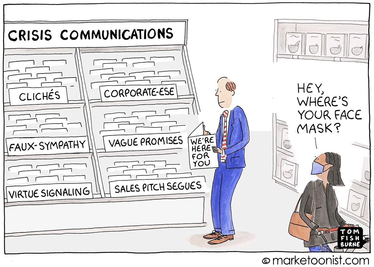
Design with sincerity. Something is happening to capitalism. It's been happening before, but the pandemic intensified the change? It made inefficiency and unfairness of financial and governmental systems all around the world more visible. People are continuously sick of corporate tropes, stock images, and homogenous design we’ve been talking about. Add real pictures of your team. Display real customer reviews on the landing.
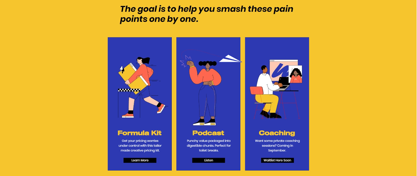
Make web-design part of your branding. We can’t emphasize it enough. When you build your digital identity, it’s important to be consistent throughout the channels you use. That touches web-design, your social media, and what’s most important - your advertising. There are lots of examples with amazing ad campaigns and interfaces that confuses so much. Don’t do that. By the way, unified communication (aka branding) is one of the things that saves people time.
Don’t shy away from local/niche designs! If your product or service is oriented on a specific location or a specific community, use an opportunity to talk with authenticity. Give people the feeling that not only your resource is for them, but you understand them: what visual arts they like, what language they speak, what pains - illustrative in the graphic elements - they have.
We treat reports about trends like slices of what’s been happening in the industry. In conclusion, it’s obvious that designing for mobile - with clear navigation and touch-based interactions, embedded even in the web - slowly becomes a norm. The best web design trends for writers are still between New York Times-style or Medium-style websites: they do their work, they are content-centered, it’s all that’s needed. The most generic display of the picture is on the Instagram card. And, even though the most popular resources become unified and look like each other, we think it’s predictable that they are like this. It’s all for practical purposes.
But. We urge people who think about web-design - whatever format of the business you have, whoever you’re selling to - don’t dive into homogenous visual style from the very start. You have a chance to experiment and to invent something new, a better way of showing your product. Richens it. Good luck with your web-designs!
Tell us about your project
Fill out the form or contact us
Tell us about your project
Thank you
Your submission is received and we will contact you soon
Follow us
