

UX in Healthcare Mobile Booking Apps: Best Practices
Consumers of digital healthcare want to access their medical records, make appointments via their mobile devices, and get — via the same devices — prescription refills. And mostly, they’re not satisfied: among existing mHealth solutions only 11% of providers offer at least one of these three functions. In this article, we’ll talk about how to design a good healthcare booking app and connect healthcare providers and patients to establish timely, convenient appointments and communication. If built, created, and used in the right way, scheduling apps are an effective channel in the brand strategy of healthcare institutions.
1. Getting started: user onboarding
Keep splash screen and instructions simple. That’s a welcome-to-our app screen that will be shown to users when they’d open the app for the first time. If that’s a scheduling app for a specific clinic, make sure to include a note on what clinic is that (because they’ve probably installed it due to your recommendation). It’s recommended to keep the design of a splash screen simple yet creative and direct users to read guidelines on how to use the app with a clear call-to-action.
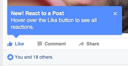
As for instructions, don’t write dithyrambs about your cool features. The more you’re talking about how to use an app, the lesser users want to continue. Describe them in the few slides. Instructions that will guide a user through possible complications in an app can occur while he or she’s already started using it in forms of tooltips.
Make registration quick and easy… And, if possible, save it for later. It’s known for a long time, that most users don’t really fond of the obligation to create account to use a service (yeah, Facebook and Instagram are doing that, but they have an established brand and people know what to expect of them without the necessity to discover them, first.)
Healthcare applications started to become popular because people want better and quicker care services, so why make them go through a long registration process? If the registration is necessary — for instance, the app is connected to hospitals’ EHR, and users need to login via a specific ID — make the number of required fields as small as possible. It’s also useful to add the option to sign up through social media or Google. However, if you ask users about their sensitive data, you’ll need to apply a lot of security restrictions — and the idea of integrating an app with third-party services might not be a good idea.
Display the main features first. There’s a possibility that using your app for the first time, some John Doe wants to make an urgent appointment as soon as he’d registered. Show main user paths in your app early and make sure that the path to booking an appointment has the shortest click-through rate (user need to click 1-2 times to perform an action.) For instance, if your app has three main functions: find a doctor & book an appointment, read about symptoms, and review users’ profile, put them all on the main screen, prioritized from the first one.
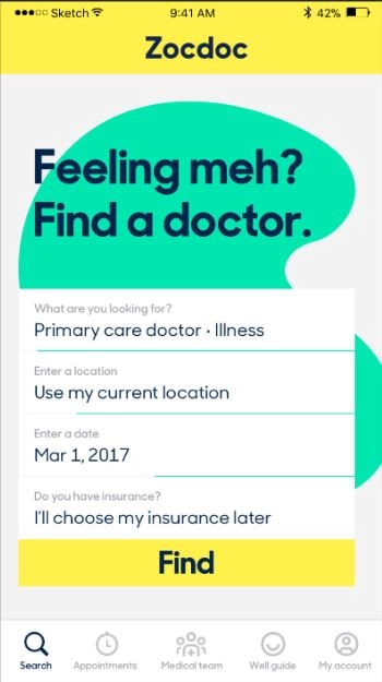
Address insurance early. Zocdoc makes their core functionality clear and simple — and they’ve also addressed the question of insurance from the start. Some of the healthcare booking apps allow users to choose insurance later, like ZocDoc. Some refuse from insurance at all, some introduce an insurance-based search: after filtering results, users see only healthcare providers who accept their kind of insurance. Usually, people worried about what an institution will do with their insurance and if it’s an issue if they don’t have any, so addressing that question from the start is a good practice.
Speak with care. Health matters the most, and while digital design can’t save lives, healthcare can — but digital solutions with content that contains complicated medicine terms can make things worth due to fear of the uncertainty. Make sure to fill up your app with empathetic, calming, understandable microcopy.
Build with accessibility in mind. Try including voice-overs and voice-recognition features to help people who can’t see or have difficulties with movement. Make sure not to convey important information with color. Make content and navigation in your app as clear, understandable as possible. The accessibility mode is a thing: a version of the app with bigger text and icons. Healthcare is the industry where ignoring W3C guidelines for accessibility have one of the largest effects on client satisfaction, so make yourself familiar with them. To see if you get them right, conduct users’ interviews.
2. Finding a doctor & scheduling appointment
Include geolocation, symptoms, type of physicians, and/or insurance-based search. Make sure to include filters and make them a part of an advanced search engine. It’ll allow an app to satisfy multiple scenarios of user behavior: for instance, they may want to book an appointment in a location that is unknown to them — so they don’t know which hospitals there accept their insurance.
For location-based search, it’s better to make offline maps available — and to display different routes to a specific location.
Sometimes, people don’t know how to address their symptoms, so connect symptoms and doctors who can treat conditions that are associated with them.
For an advanced search, it is a good practice to show results after applying each filter: it gives the user a feeling of a process. Also, the search bar — if not a form, like on Zocdoc screen above — is the better option than a search tab. Your app will be used by a person with clear intention, so be sure to make it easy and the search bar is visible.
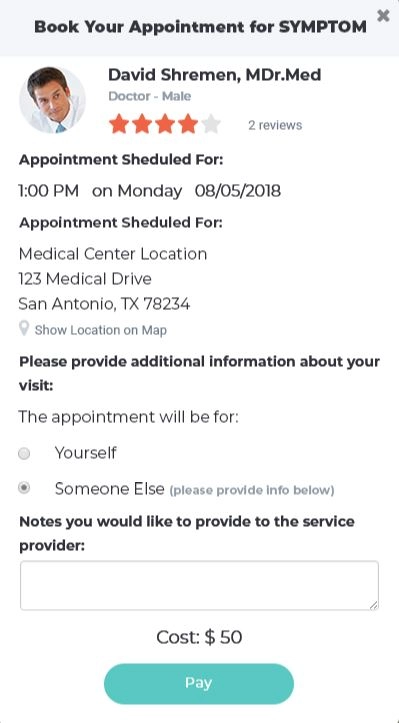
Show free hours only. The main value of booking healthcare apps is in remote scheduling, so make sure the physicians’ calendars — in EHRs, Google Calendar, etc. — is connected to your app and is up to date. It’s better to show free hours only. Don’t forget to include the options to cancel and rebook the appointment!
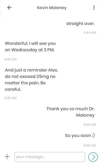
Introduce communication tools. People often anxious about their health, and they’re often anxious over their time. In a new location, they can be anxious about so much more than that. Being a point of interaction between physicians and users, your app can connect them. Online consultations — via chats or video calls (telemedicine) — is another big thing for healthcare apps in general, but if you include to your app some options, even the simplest ones, they will improve user experience.
Create doctors’ and clinics’ profiles with their rating. Include patients’ feedback and rating of each institution in your app. Ask clinics you’re collaborating with (or your staff) to describe themselves and their experience and their relationships with their patients. It’d be useful to let doctors articulate their position towards minorities and describe themselves, as, for instance, LGBT- and PoC-friendly, etc.
Include different payment options. Consumers prefer a choice. Introduce pre- and post-appointment payment options. Accept payments from different paying systems and through different gateways (we recommend Stripe.com). Ask if there’s a possibility to accept mobile app payments in healthcare institutions’ you’re working with. Don’t forget to not store users’ payment information in your system. Also, a function that allows screening a credit card is also nice and user-friendly.
3. Reminding about the appointment
Utilize push-notifications and emails. Healthcare industry has only started to fully use push-notifications, but in Wellness, as you remember, they are already used at full capacity:

The main idea of push-notification is to convey necessary and useful information through a message that will absolutely be seen. In our case, the main functionality is booking appointments, so an app should remind users about them. Be clear and caring in your language. Include information on when and where an appointment will happen in the notification and send it a few times before the event. Make sure the app allows multiple options on timing and amount of reminders.
Emails would be useful to provide users with, again, reminders — and, possibly, with a content on how to treat their condition if there’s any better; healthy lifestyle advice; news on patient health. Invoices also should be sent via email.
Connect booking app to a calendar. Just remember how travel booking apps are acting, if you sign in via email — after you paid for your trip, it appears in your calendar. Healthcare booking apps should also provide an opportunity to do that: it would help people plan their day of the appointment at work and at home to avoid disrupting any important matter.
Introduce recurring reminders. Recurring reminders can be valuable to users who’re, for instance, are constantly forgetting about regular visits to dentists or regular HIV/other STDs testings.
4. Post-appointment: retention & engagement in healthcare apps
Collect feedback. User-generated content drives users’ trust and, therefore, their engagement. Create a section where user can leave feedback both on an app’s functionality and on the quality of providers’ services.
Show lab results and prescriptions. You can add to the value of your app through a section with patients’ lab results, receipts for necessary meds, and other info related to their past appointment. That function will save lots of time for patients. Push-notifications about lab results that are arrived after appointment are also a good thing.
Include options for doctors to reach out to patients after the appointment. Physicians engagement into mHealth is a matter for another article, but it’s still important to say this: the more physicians are involved and interested in establishing a digital connection with their patients, the more effective and successful the app will be. So, if you’re introducing an app to your organization — or if you’re collaborating with hospitals, private clinics or practitioners, explain that their input in communication is of great value. Casual checkups via chats, especially after a difficult diagnosis, will be much appreciated.
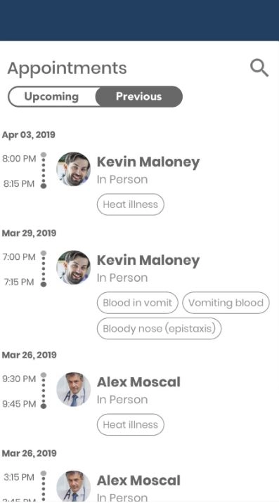
Include info about past appointments into patients’ profile. Yes, that’s an additional feature, but it will allow a) patients — to track their treatment history and to see the overall state of their health, b) doctors — to understand a context a patient is currently in. If you want to include the last feature, remember that you need to ask for consent to share their data with doctors they’ve chosen to visit. Also, if your app is storing health information it needs to be HIPAA-compliant.
The mHealth app market is rising
The one thing the digital disruption has completed with striking success is making consumer demand louder — for each possible vertical. Businesses started to adjust how they work in order to keep up with that demand, and for software delopment healthcare that meant the necessity to shift to value-based care, targeted at optimizing providers’ workflow and improving care outcomes for patients.
In 2018, almost half of the healthcare consumers used mobile to manage their health, and, as they seek to receive high-quality care and, at the same time, spend less time to get it, mHeath apps, booking apps included, are a wonderful opportunity for healthcare institutions to offer something that others don't. For digital market players, it’s also a way to penetrate the new, fast-paced market and make a huge difference.
But, despite the fact that the state of the market is optimistic, the mobile app market is extremely competing. And users are ruthless to bad user experiences and to lack of functions they expect to see in hospitals’ apps. So, building any mHealth solution, make sure you know what they expect to see (see the beginning of an article) and have all the tools and info to make their experience good.
Tell us about your project
Fill out the form or contact us

Tell us about your project
Thank you
Your submission is received and we will contact you soon
Follow us
